
A brand’s logo is the base of its visual identity. Every brand wants to opt for a design that is unique, aesthetically pleasing and representative of the organization. Symbols, products, animals, flowers, motifs and a million other things can be a logo for a brand. One type of logo is the wordmark.
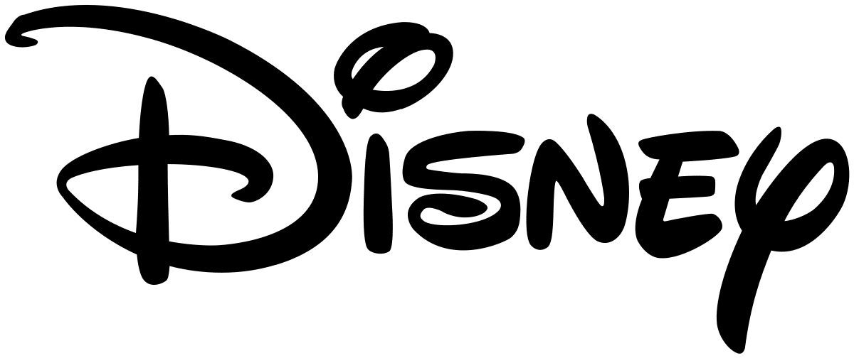
What happens in your mind when you visualize Coca-Cola or Disney? The words, in their own classic font appear, right? These examples show that wordmarks can be a powerful tool in your branding strategy.
What is Wordmark Logo?
A wordmark or logotype are logos that are made utilizing the business name, product or services. It is the unique text-only typographic treatment of the business name to make it identifiable as the brand identity or logo. Wordmarks make a perfect and easy logo, especially for small business owners.
Although most small business owners overlook the possibility of a wordmark logo and opt for a sophisticated graphic design or a generic icon. But these options don’t possess the inherit benefits that are associated with a wordmark logo.
- Wordmark logos are more identifiable.
- Wordmark logos make it easier to remember the brand name.
- Wordmark logos are simple to use.
- Wordmark logos are timeless and need less variation over time.
- Wordmark logos that match the domain name you pick make your site’s address more memorable.
Benefits of Wordmark Logo Design
Deciding the type of logo you want to use is a crucial first step in designing your brand identity. Wordmark logos are often overlooked, but they carry significant benefits.
- People Will Know Your Brand Name
Getting your name out there is essential to the success of your business. Having your brand name in your logo speeds up this process. It takes five to seven impressions for customers to recognize a company emblem; use a wordmark, and it will take the same amount of time for them to visualize your company name.
- Cost Saving
- Creative Ease
The world doesn’t need another sandwich shop with a cheeseburger logo, or airline with a plane design. Instead of sticking to seedy stereotypes, focusing on the lettering will ensure your design is unique and stands out from the crowd.
- Endures The Test of Time
Logo designs have trends that come and go. For example, recently there’s been a resurgence in vintage 80’s themed emblems. Keeping it simple and using a wordmark ensures that your logo won’t go out of style and end up looking dated.
It may seem overwhelming to create a branding element from a word, but it’s much easier than you think. By experimenting with the following five design factors, you can develop a unique emblem that’s personalized to your company.
Considerations for the Perfect Wordmark Logo
Fonts
Serif versus Sans-Serif
Serif fonts are typefaces that have serifs, which are extra strokes on the ends of their letterforms. These typefaces evoke feelings of history, tradition, honesty, and integrity. There are many fonts that fall into the serif category containing different shapes, thicknesses, and lengths. Common Serif fonts are:
- Times New Roman
- Garamond
- Editorial New
Sans-serif fonts are typefaces that do not have serifs on the ends of their letterforms. They are considered more modern and minimalist and are known for their high legibility. These fonts lack additional flourishes and have a more orderly and clean appearance. Common Sans-serif fonts are:
- Arial
- Futura
- Avenir
Script versus Block
Script is a great way to communicate elegance and style. Many high-class organizations opt for script-based emblems. The calligraphic style is reminiscent of signatures made popular by the historic upper classes. Back then, the ability to write was directly tied to your education level.
Block lettering inspires trust in the viewer. If you want to portray your business as well-established, secure and trustworthy, then opting for block lettering is the way to go. Strong, bold fonts are preferable.
Vintage versus Modern
Vintage lettering is ideal for companies that want to take you back to a specific point in time. As vintage fonts already have a strong character, they’re perfect to use if you want to evoke feelings of particular time periods.
Modern fonts are entirely different. They’re more at home in sci-fi movies or tech products. These innovative typefaces are perfect for forward-thinking companies that want their audience to know they’re looking to the future.
Before you start creating your logo, list some words that best describe your brand identity. When you start designing, aim for styles that also reflect these descriptors.
Character Features
Character features are an essential asset of wordmark logos. Including a letter that has a distinctive element helps your design stand out from others. Consider the “D” in the Disney logo above. That branding is so recognizable that, even without the rest of the word, we know what company it’s advertising.
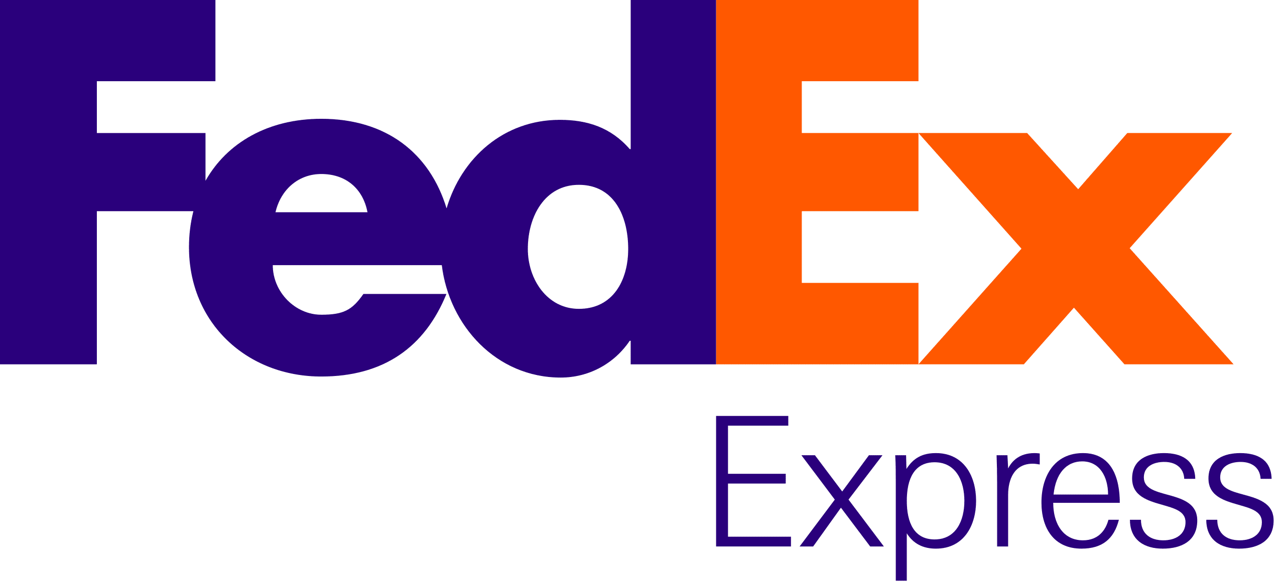
It’s essential not to add features for no reason. Make sure the design is representative of your company and ideology. You could choose to use that letter as your favicon, or maybe it creates a visual that represents what you’re selling. For examples, the “Ex” in the FedEx logo contains an arrow in the negative space between the letters. Since FedEx is about shipping and moving things forward, this feature is entirely appropriate.
Kerning and Casing
Spacing is often overlooked when it comes to wordmark logos. Especially for inexperienced graphic designers. Yet, the gaps between your letters can be just as significant as the letters themselves. Closer together depicts a secure and robust brand; further apart makes your brand appear more accessible and open.
The same is true when it comes to letter casing. Where you utilize capital letters will change the final impact considerably. For instance, a strong, outgoing brand may benefit from using caps for the whole wordmark. However, if you want to communicate a relaxed, easy-going vibe, then opting for lowercase will help convey this feeling.
Shapes
Shape is an additional element that can transform a wordmark logo. You can highlight parts of the word, or surround the full wordmark with a shape. Always be aware of any extra meaning this adds. For example, the arrow below the Amazon logo broadcasts the wide variety (A to Z) of products that are sold on Amazon.
The other opportunity to play with shapes is within the negative space of your wordmark. The gaps between letters have the potential to create structures that add even more meaning to the logo. A fantastic example of this is the Formula One Racing logo wordmark. But just as the FedEx logo uses negative space to its advantage, so does Formula One. Look between the “F” and the red flames. The “1” in Formula One is clearly present in white.
Colors
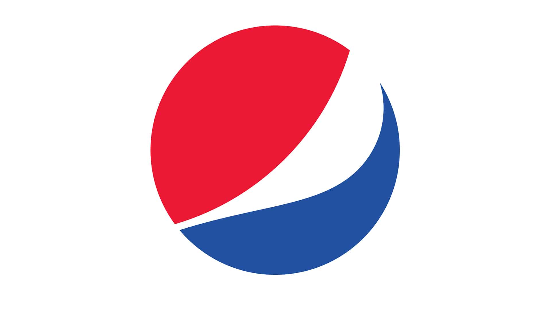
Perhaps the most critical element of your logo is color. The psychology of color is well documented To experience this, simply play around with famous logos and their colors. Would the renowned McDonalds “M” be as successful if it were in black? Or what if the red, white and blue Pepsi logo were changed to purple, green and gold? Neither brand would have the same emotional impact.
In considering certain colors for your logo, you must understand the feelings that each hue portrays.
- Red: exciting, youthful, bold
- Blue: trustworthy and dependable
- Purple: luxury, elegance, wisdom
- Yellow/Orange: happy, friendly, optimistic
Some brands choose to have one letter shaded differently to highlight a concept, or color the background and leave the wordmark white. Levi’s is an excellent example of the latter; the letters are etched into a red background.
Choosing a Wordmark Logo for Your Business
Hopefully we were able to help you begin the process of creating a professional wordmark logo for your business. Nonetheless, this option won’t always be appropriate for everyone.
While most small-business owners immediately opt for an icon or monogram, using a wordmark logo helps you stand out from the crowd. Be sure you understand the five main elements and you can create a design for your brand that’s impactful and memorable.
And as always, if you need a logo designed you can contact hour23design today.